We designed the digital experience for FREC, a platform created for people looking to invest with more control, clarity, and benefits than traditional options.
View site liveOverview
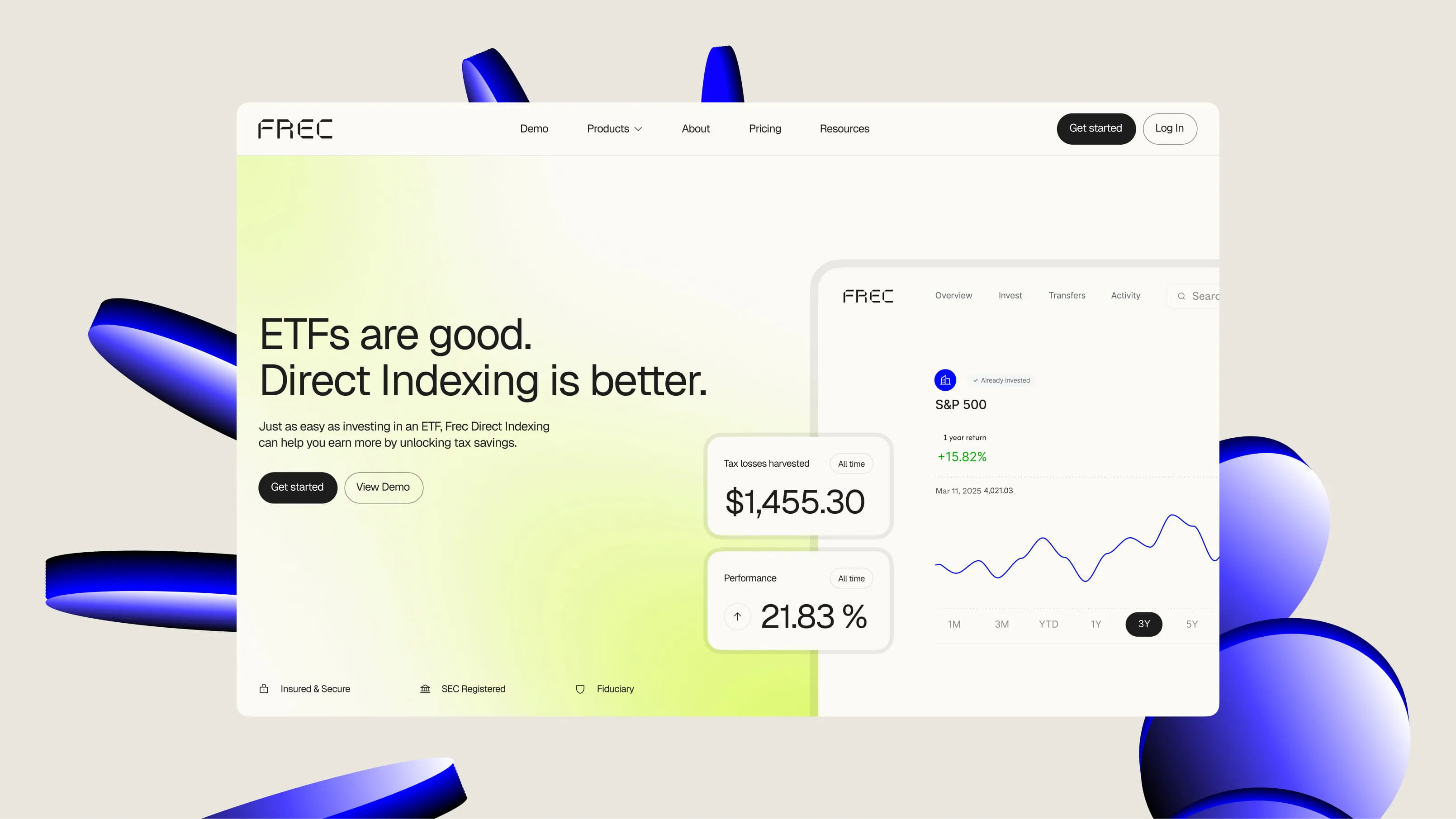
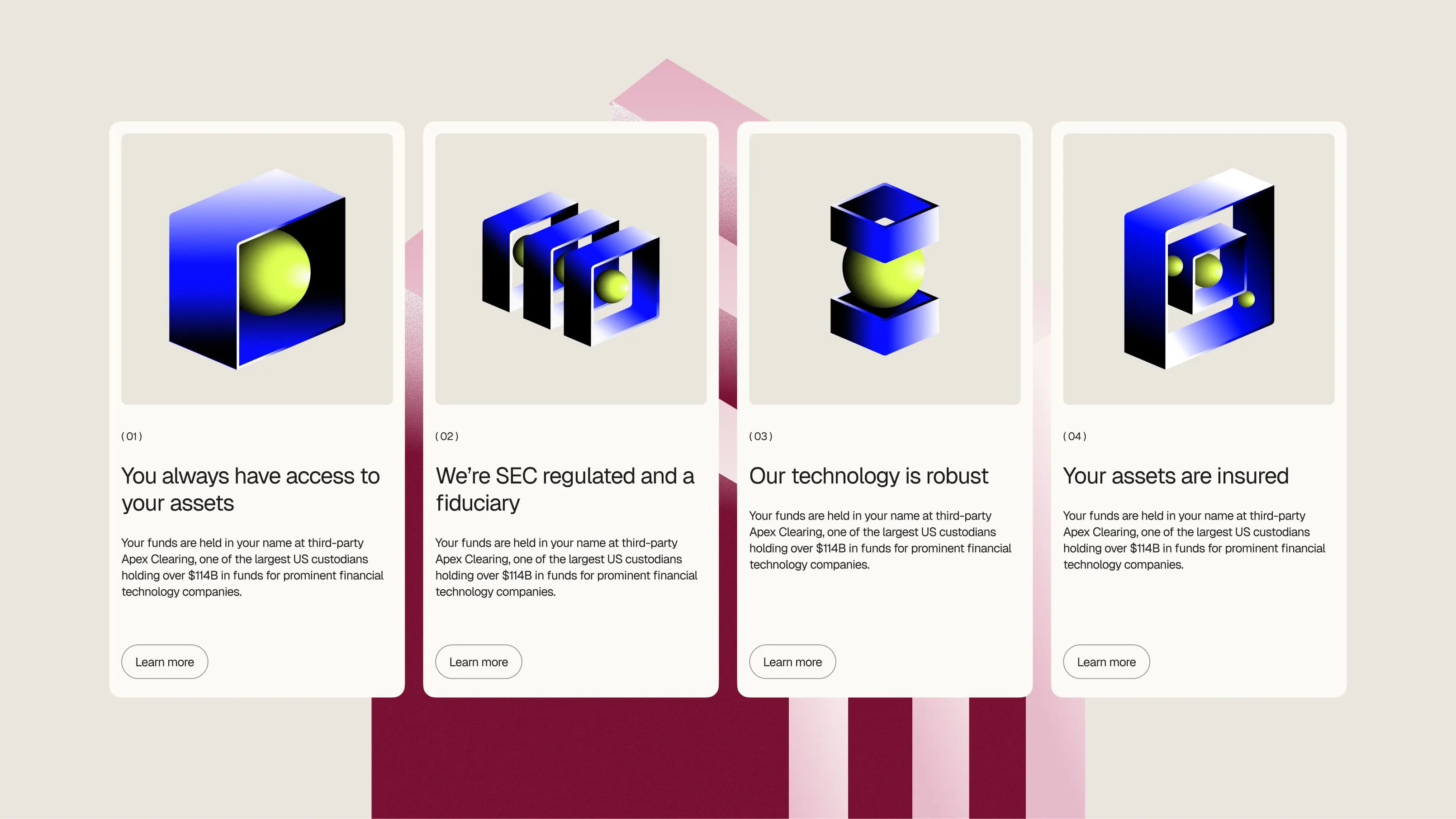
FREC is a San Francisco-based fintech company that offers direct indexing as an alternative to traditional forms of investment. Its product targets users seeking greater control, tax efficiency, and customization in building their portfolios.
The challenge was not in the technology, but in communication: how to explain a sophisticated product without resorting to the technical language of the financial industry. The brand needed a modern, clear, and attractive website capable of conveying complex benefits in a simple and user-centered way.
The challenge was not in the technology, but in communication: how to explain a sophisticated product without resorting to the technical language of the financial industry. The brand needed a modern, clear, and attractive website capable of conveying complex benefits in a simple and user-centered way.
approach
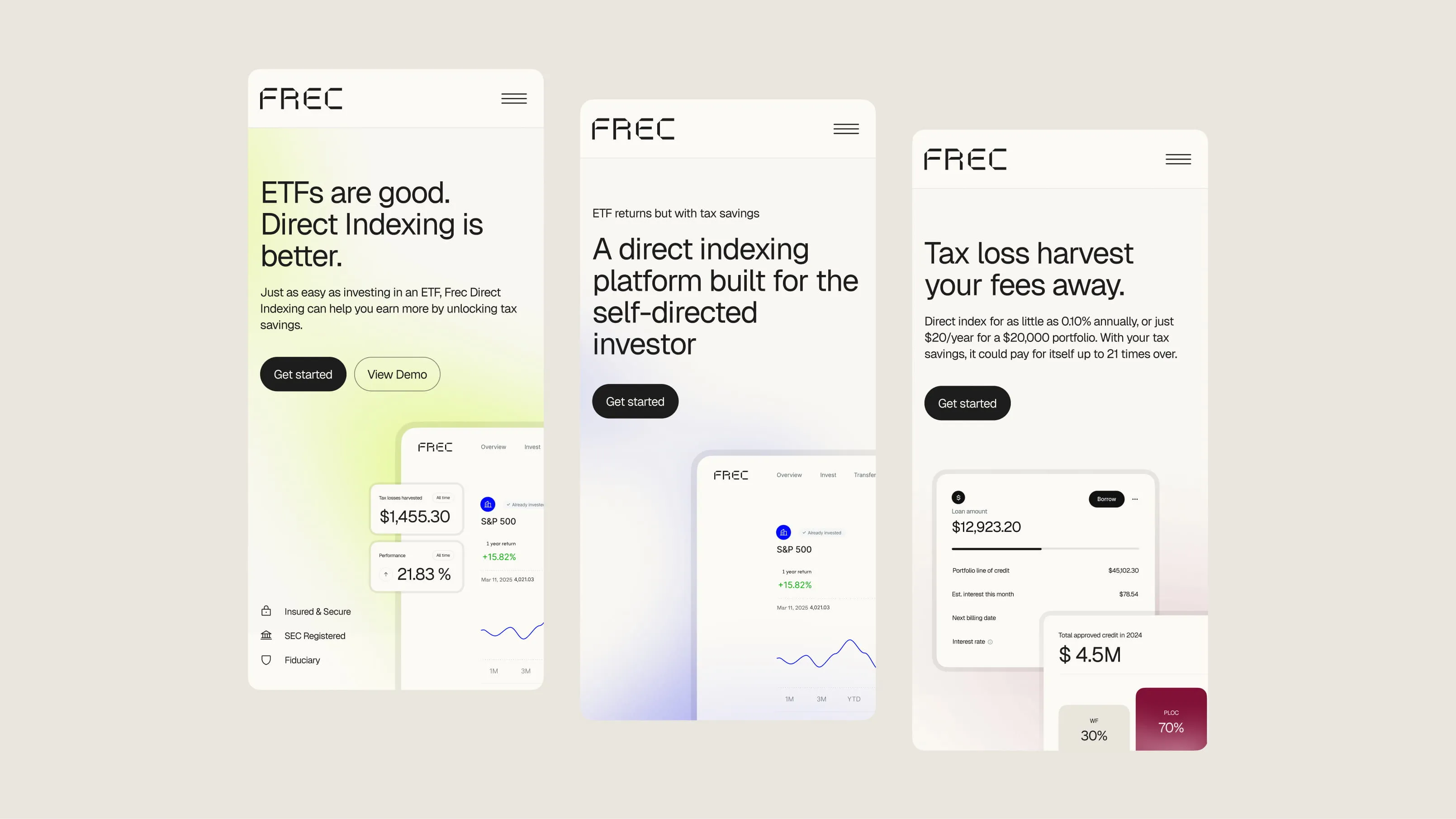
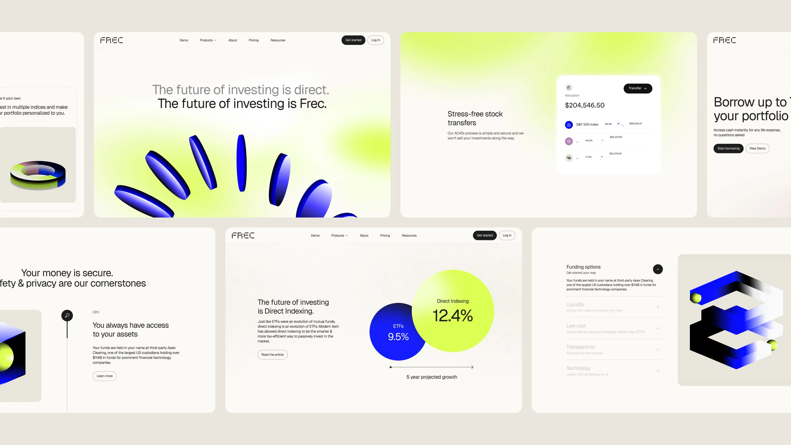
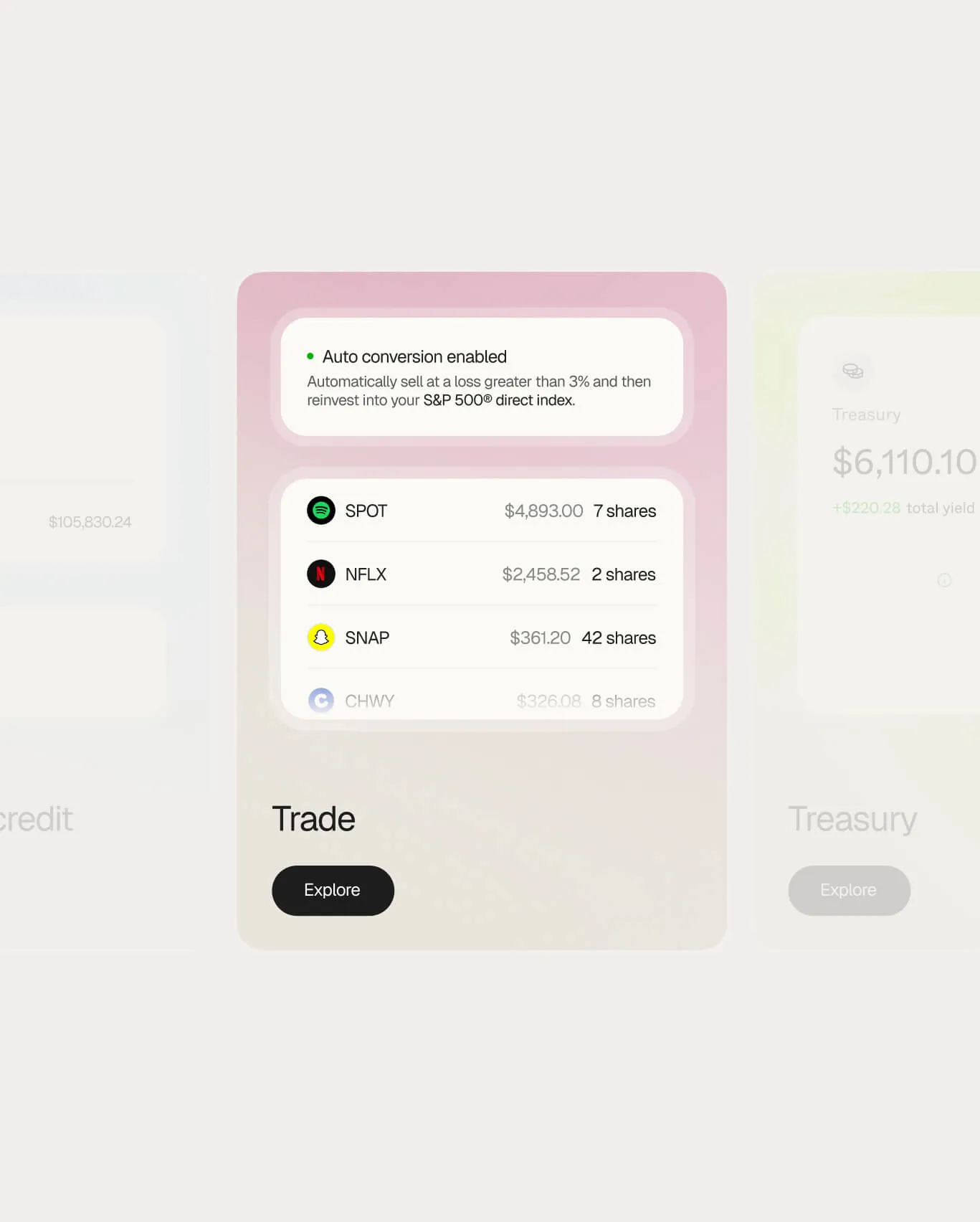
We developed the information architecture, wireframes, and visual design of the site to transform a complex product into a clear and accessible experience. The content and interface were built around the real benefits for the user: control, fiscal efficiency, and personalization.
We took the rebranding carried out by Stink Studios in the United States as a basis and applied it to the digital product, creating a modern visual language in line with technology industry standards. The result is a sophisticated and accessible site, designed to present FREC with the confidence and clarity that a high-value financial product requires.
We took the rebranding carried out by Stink Studios in the United States as a basis and applied it to the digital product, creating a modern visual language in line with technology industry standards. The result is a sophisticated and accessible site, designed to present FREC with the confidence and clarity that a high-value financial product requires.


.webp)